Saturday, December 15, 2018

Very Last Blog Ever

   What were your expectations for this course and where they met?
I wanted to learn aboutpainting, drawing, sketching, different types of art and artists. I did learn a lot about different artists from all different ages. I loved the couple drawing assignments we had. I enjoyed this class a lot. Some projects were a lot of fun! I wish there was more hands-on drawing rather than reading, watching and writing. It was very time consuming. 

Now that you've been through this course, what is art? How would you define it now compared to your initial posting?

Honestly, art is what you make of it. To me, I think art is beauty. Something pleasing to the eye. I am someone who enjoys skill, symmetry, beauty, pleasing art. When I paint I do beaches, pin up girls, flowers, animals, beauty! I don’t agree with a lot of “art”. When an artist makes scribbles and lines and abstract stuff I don’t like that at all. That to me is not art. I know a friend who draws absolutely beautiful sketches of all sorts of happy, positive things that are absolutely jaw dropping because they look real, and detailed and show extreme talent. Art is beauty!

Who was your favorite artist in your original posting and who is your favorite visual artist now? If there is a difference, why do you think so? If you have the same favorite artist, why do you think so? 

I don’t have a favorite artist and I never have. I enjoy all different art. There is one artist I absolutely love and I have written about him in one of my previous blogs. I don't have his name off the top pf my head, his art is at my parents house. He paints beautiful tropical images onto tiles. He uses vibrant colors and they are stunning. I will always enjoy the same kind of art I always have. 

Now that you've completed this course, how do you feel about taking an online course? Is your answer the same as it was in your first posting? How is it the same or different?

I enjoy the online classes because i work a lot. Im not a huge fan of the college campus anyway, so if I can get away from it i can. I enjoy doing my work at home, or wherever life takes me! It is much more work, but it is worth it. 

Friday, December 7, 2018

Last Project!! Self Portrait


1. Why did you select the inspiration pieces?I selected the three artworks I did as inspiration because each one of them show the beauty in women. Each piece is realistic, and attractive. The first woman (Bess Norriss) appears very happy and confident standing straight with her hand on her hip like a boss. The second woman appears to be showing a bit of sexuality. Her makeup is beautiful and sexy, as she makes a cute face with her lips pouting in a sexual way. Lastly, the last woman Frida Kahlo has her shirt pulled up her back as she lies in a bed smirking making a sneaky face. She looks happy and confident in her body and her image. 


2. Why did you select the media to create your self-portrait? Ichose to use pencil because for a picture like a self-portrait I feel like pencil is the best choice for a realistic look, which is what I was going for. Pencil can shade, it can erase, it seems like the best way for me personally to create a very realistic, accurate picture!

3. What challenges did you face in creating your self-portrait and how did you overcome them? It was very hard actually! It is difficult to draw yourself, let alone draw anything at all! It is hard to get the shapes right in the face, the proportions, shading, etc. I erased a lot, and tried over and over again that is how I overcame my obstacles. 

4. How does this piece represent you? This piece represents me in every way! I am smiling…because I am always happy. I am also holding my Pitbull. He is everything to me and I love him more than anything in this world! I have grown a huge love and passion for the breed and one day I will do my part in helping rescue them. 

5. What elements and principles of art did you apply in this work? I used symmetry, line, balance, texture, contrast, etc. My image is symmetric. I believe that symmetry is beauty. Lines I used throughout the whole picture to create it. It is balanced as it is centered in the middle of the paper. My hair gently falls onto my dog as my head is tilted into his, creating a balance in the picture. Texture is shown through my hair, and in my dog’s nose and mouth. I shaded his dark spots and made my hair look textured. I used contrast in shades of grey through pressing the pencil down harder in certain spots making some lighter or darker than others. 

6. Did you enjoy working on this project? I did enjoy working on this project because it was of ME! It was fun and different. I like using pencil and doing what I want to do. I liked the fact that it could be done in any media too. So happy I got to incorporate my dog into it.

7. What do you think of your final artwork? I love my final artwork. Now that I have drawn it with pencil, next time I think it would be cool to do an acrylic or oil paint. I liked the photo I chose and it shows my confidence, happiness, and love for animals. 


Inspiration Pieces from Google Arts & Culture:
1. Bess Norriss Tait

1.
Name: Bess Norriss Tait
Title: Self Portrait
Media: drawing 
Size: 15.5 x 29.5cm
Year: 1909


2. Cindy Sherman
2.
Name: Cindy Sherman
Title: Madonna
Media: Gelatin Silver Print
Size: not mentioned
Year: 1975


3. Frida Kahlo Lying Down

3. 
Title: Frida Kahlo Lying Down
Name: Nickolas Muray
Media: photograph
Size: not mentioned
Year: 1946

Original picture of me
My Final Sketch


Friday, November 30, 2018

Reflection Blog from project

    I chose The Pleasures of Life as my theme for my exhibit because it is purely happy, exciting and positive. I think a lot of art is sad, emotional, abstract and strange. But in my opinion of art, it is something that makes you happy. Art can never be wrong, it is what you think is worthy of being considered a work of art. We all perceive art differently. I love pieces that make us smile. I think we need to stop being negative and focus on the positives and be blessed and grateful of life. Love, sex, traveling, eating, sleeping, playing with our animals, are all pleasures of this life and that is what I wanted to portray in my exhibit. I did the font of the first slides in a cursive font, and the second half in a more bold, unique font. The first ones have to do with emotion, love, sex. As the second half includes the adventure, food, animals, the holidays, the physical joys of life. All artworks were done with paint, and most are modern. Everything I used was of real things, people, places, trees, animals, food. I think my exhibit will make people happy and that is most important to me. Not only did I enjoy each piece, but they were all visually attractive and beautifully done. I see skill in each and every painting. 

Thursday, November 29, 2018

Video Review

1.    For each video list/discuss the key concepts you learned.
Lowdown on Lowbrow: This video was my favorite. It was fun and different, and wild. It talked about provocative artwork, dirty, sexual, “bad”, not your usual classic artwork. I love it I think it’s the best artwork. I am obsessed with the pin up girls, the traditional tattoo designs, the beautiful girls on motorcycles, the wild colors and cool designs. It is vibrant and fun to look at. I prefer this kind of art over the basic boring artwork. 
Tate Modern: This video was a little slow, showing the exhibits in the Tate Modern art museum. The museum tries to revolutionize the way people perceive art. They show similar art together. Artwork from the 60’s and 70’s is grouped together. No matter where they are from, there is a general idea of the time they were created. In one room they have works of art from Italy, America, japan, etc. The way the exhibitions are set up are really interesting.
An Acquiring Mind: In the Metropolitan museum of art we see history through its work. We see artwork from every year, every century, every country, religion, etc. This museum is amazing. We see that Phillipe de Montebello has done an amazing job at directing the MET. He guided the acquisition of more than 84,000 works of art and completely made this museum much more diverse since it opened. Instead of focusing on just old classic English paintings, he has brought in a way bigger diverse selection of art making this museum awesome!! I would love to see it one day. 
2.    Do the videos relate to the creation of your Art Exhibition project? If yes, explain how. If no, explain why not.
Yes, they do. We see the different types of art work as well as the way the exhibits are set up. You can really create your own exhibit the way you would like. In art, I do not think there is a right or wrong. It all depends on what YOU think is artwork, what YOU find beautiful. I loved the first video because I can relate to it. I love drawing pin up girls, I think the traditional tattoos are cool and I think sexuality is fun and feminine. I got my idea from this video to do pleasures of life as my exhibit theme because it’s fun and happy and full of excitement! 
3.    What is your opinion of the films? Do they add depth to understanding of the art concepts you practiced while creating your curation project?

Yes, I would say the lowbrow one was my favorite this semester! It adds a different taste to art, a fun side. It helped me create my project because it shows that art doesn’t have boundaries. Take a chance and be crazy if you want. The last two videos showed me that art exhibits can be made up of anything if they relate in your mind. I saw a lot of different exhibits and it definitely helped me with my own project ! 

Friday, November 16, 2018

Module 12 Blog Review

Rachel Callea
1. Explain why you selected each of the TWO videos you choose from the selection listed above: I chose, Abstract Expressionism and Pop: Art of the 50’s and 60’s and Hockney on Photography. The first one sounds awesome, Pop art of the 50s and 60s! Seems colorful and wild and fun and I’m interested in the video. The photography video because I think photography is cool, it’s very creative and beautiful. Curious to see what kind of photography he does, and also curious what kind of pop art I’ll be seeing!
2. For each video list/discuss the key concepts you learned:Abstract Expressionism and Pop: Art of the 50’s and 60’s: For abstract art, you are not to think about what it shows but to think and feel what the painting is. There is a strength of contrast, white fine lines on a black background. Franz Kline was a popular abstract artist. Sensual impact and ambiguity are important. Color did not play an important role to him until his later abstract paintings. There is a language of abstraction. It captures emotion. Our assumption of the role of black and white determine our idea of depth and surface. Franz Cline was an action painter. 
Hockney on Photography:David Hockney is one of Britain’s greatest painters, as well as an amazing photographer. The camera is older than photography. Photography is the chemical invention of how to put the image on a flat surface with light that reacts to things. It was used by painters before. Photography has become a collage. Is photography an art? Or a fantastic tool? Hockney is a painter who takes a series of images from a camera and rearranges them. He keeps all his photography albums. He started with a polaroid camera in Los Angeles. Hockney’s work is very different and unique. 
2. How do the videos relate to the readings in the text:The videos relate completely with the book. Starting on page 500 we see abstract art just like Franz Kline’s artwork. Jackson Pollock’s, Number 1, shows an all-black background is splattered white paint along with a few other basic colors. We can call Pollock and Kline abstract expressionists. The next few pages display abstract images like we saw in the film. The last few pages of the chapter we see photography relating to the Hockney film. One that stood out to me was David Wojnarowicz, Americans can’t deal with death. This was acrylic and photographs on board. Very similar to David’s style of work. 
3. What is your opinion of the films? How do they add depth to understanding of the readings and art concepts:My opinion of the films is that they both were different than I was expecting. A little outdated and hard to follow through. The first was a lot of abstract, bland, art. We see that lines and color play a big role in abstract art. There is a lot of white streaks against black paint, very little colors, shapes, etc. For the photography film, it makes us think whether or not photography is art. We see that it can turn into a collage, the images can be placed a certain way on paper, they can turn into paintings, etc. I think it is art in a way, but not completely. I believe art comes from your hands and skill. A camera does that for you. It is what you do with it after that creates the real art, like Hockney’s. 

Friday, November 9, 2018

Module 11 art gallery visit

Birchfield Penney Art Center

The Exhibition

1. The Contradictions of Being: Composite works by Harvey Breverman
2. The theme focuses on works by the artists starting in the 1970s, showing the technique of montage, bringing together disparate elements in a composition in order to create tension. According to the Birchfield Penney Art Center website, the focus of his exhibition was the political unrest on college campuses in response to the Vietnam war in the late 60s early 70s.


The Gallery
(The East Gallery)

1. The type of lighting used was actually very light. On the ceiling there were a bunch of white circular bright lights that shined over all the paintings. It really brightened up the art and made them stand out and appear very bold. Great choice of lighting.
2. The wall colors were simple, and white. There was no texture or patterns, just plain smooth simple white walls. This helped bring out the paintings even more, as they were very vibrant, detailed and colorful.
3. The materials used on the interior would include a tan wooden floor, light fixtures on the ceilings, one light grey tiled wall, and simple white walls that hung paintings.
4. The movement through the gallery is kind of twisted and turned. It all has the same vibe, colors, lighting and architecture. As you move from one to the next you see the title of the exhibit on a large white wall as its artwork follows on the walls.

The Artwork

1.  The artworks were evenly placed on the wall in no particular organized fashion. Just next to one another, with even distance in between.
2. The artworks are all similar in size, color and theme. Also all oil on canvas. The theme of the late 60s early 70s during Vietnam.
3. Each piece is different in the way that they are all different images, different styles and places.
4. Each artwork is framed by a very thin golden frame.
5. Each painting has a small white card to the right of it in black ink describing it, identifying the name and labeling.
6. They are probably about two feet from each other, each painting is fairly large.

3 Selected Paintings

1. Artist: Harvey Breverman 
Title: Interior/exterior
media: oil on canvas
Date: 1995
Size: 3ft x 4ft

I see a beautiful golden building that is detailed with pillars and windows and patterns. A black swirled staircase with a mans hand at the bottom, and a woman's legs dangling off the top of the staircase with a golden skirt and heels. Behind is a hanging mirror. A golden vertical pole stands in the middle of the image. Line is used in the middle pole, building and windows. Color is used as the gold is very vibrant and the black staircase and background is very bold. The staircase in black balances out the rest of the vibrant image. I notice a story behind the man at the bottom and the woman on top, as if maybe the man is after this mysterious woman on top. Maybe it is showing behind the scenes of a relationship, interior/exterior. The outside is attractive the inside is mysterious. This was my favorite piece because it was so eye catching and beautiful. 

2. Artsist: Harvey Breverman
Title: Discontinuous Sequence: Decline of the West

media: oil on canvas
Date: 1974
Size: This is in two pieces, one about 3ft x 4ft, the top one, pry 1ft x 4 ft

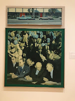
I see a large image of older men, who appeared to be politicians talking. Their heads then fade into cactuses. The top picture is of two cars, one blue one grey outside of a building with palm trees and two red doors. I see texture as the mens head turn to cactus. You can see the prickly, rough texture of them as they start to fade in the background. Color black is used to pop the cactus. Line is used in the top photo on the street, the pole in the middle, the windows, doors, etc. This image is very symmetric.  I think the cactus symbolizes that these guys are all arguing and hard headed. Their cars show the calm outside of the building they are in. The author is trying to show us government officials from WW2 in Los Angeles, California.

3. Artist: Charles E. Burchfield
   Title: Light coming into a woods
   media: watercolor on paper
   Date: 1954
   Size: 2ft x 3ft

This painting was so awesome to me an unique. I see dark pine trees and dead trees in a forest with a swirling white and grey cloud in the background. This one was very unique, part of a different exhibit right next to the previous one I spoke about. The lines of the trees create cool patterns and draw your attention. We see contrast of color, black trees and white snow and clouds. The texture of the ground seems very rough and cold. This painting is very balanced in the way that there trees balance out the swirling cloud and ground, in a symmetrical way. Perspective shows that the front tree is closest, it is bigger, but crumbled and dead. This image gives off a mysterious, spooky, yet beautiful dark mood. The trees are dark, and dead. Not quite sure what the artist is telling us, but maybe he just wanted to show emotion. 

What did you think of visiting the Gallery and purposefully looking at the exhibition from a different perspective - the physical space, the architecture, theme, etc.?

I enjoyed it! I liked the exhibit I chose and it was cool to see a bunch of similar images together. Honestly, I never even thought that they would be organized by artist. I loved that all of Harvey Breverman's work was displayed together. his work was so awesome to me, happy, vibrant and fun. I never thought about the lighting above the art, the color of the walls or the architecture inside. You see how lighting, wall color and architecture really changes the way you view the art. For example, Harvey's was bright, white walls, vibrant because his work was, for another exhibit I saw with artwork less pleasant, had dark grey walls and dimmer lightening. The exhibit has a lot to do with the way you view artwork and I never really noticed that until the other day when I did the project! 

Wednesday, November 7, 2018

Module 11 video blog

1.  Explain why you selected each of the TWO videos you choose from the selection listed above:I chose the video, Matisse and Picassobecause they are two very well-known artists. Henri Matisse and Pablo Picasso were amazing artists of the early 1900s. I do not know too much about their work however, and I chose to watch the video to find out. I would love to compare and contrast them and their work, see how similar they really are to one another! Secondly, I chose expressionism, because it seemed interesting when I researched it. Expressionism was a modernist movement, in poetry and painting, at the beginning of the 20thcentury, originating in Germany. During this time, artists expressed emotional experiences through their paintings or other forms of art. The work was usually distorted for emotional effects to evoke moods and ideas. The images on google of expressionism were very vibrant, crazy and colorful! 

2.  For each video list/discuss the key concepts you learned: At the start of the first video, Matisse and Picasso, the artist in the beginning explains that painting and drawing are the same thing. Drawing is just painting with less materials. “On a white sheet of paper, with pen and ink, you can, when you create different contrasts through volume, change the quality of the paper, make the surface fluid, light, or hard, without using shadow or light”. The relationship between both artists was unique, there had been nothing like it in all of art history. The American Stine family loved Matisse’s piece of his wife Emily. However, it made the French people angry. Picassos father was an art teacher. Picasso thought of himself as a worker, he was impulsive and worked in his overalls, not like Matisse, who was very French. Picassos work looked a bit abstract. The painting of his whores, and the girl in the field, their faces are all ugly and distorted. Matisse was very simple in his work. However, their work did look similar. 

Expressionism: The first painting they show is ashes. Showing the emotion between the man and woman. Her body is glowing red, showing she is no longer innocent. We see passion and confusion of the sexes and sexuality. They are the modern Adam and Eve. Her hair is fire red. This painting displays a lot of emotion! The artist changes the artwork, now the woman’s body is thinner, darker, longer hair. She now looks like medusa. She still shows sexuality, but she is now a predator. Another one shows arrogance, curly lighter hair, different body again. You can change an image a million times to show different emotions and tell different stories. The next painting shows Life love and death in the freeze of life. Men and woman are frozen in their emotions, showing misery, sadness. The artist’s name is Munch. All of his work is very emotional and shows different moods and feelings.

3.  How do the videos relate to the readings in the text? Page 485 we see Henri Matisse. The whole page gives a quick description of his life and artwork. The first video also did the same, we learned a lot about him and got a good idea of his style of artwork. Next, we see Picasso on page 488. His life was defined in a one-page bibliography. Like the first film we get a good look into both artists’ lives, but the film of course had much more detail and showed a lot more of their works of art. Finally, expressionism was shown all through out this chapter. Distort visual appearances, is a part of expressionism. Picasso did this in mostly all of his paintings. Lastly, according to the book, expressionism is to express emotional states, especially the artist’s own personal feelings. Matisse was the king of this in all his work! Every single one showed extreme feeling, mood, and emotion especially Ashes, my favorite one. 


4.  What is your opinion of the films? How do they add depth to understanding of the readings and art concepts? I think that the first film was a little hard to follow. It looked like a very old film. The people were all old and spoke in French. A little boring for someone my age to follow and get into. I did see a lot of Picasso and Matisse’s work though, and I could compare and contrast them. I learned a lot that I did not know. The second film expressionism was much more interesting in my opinion. This film showed depth in how much goes into expressionism works of art. We saw a lot of art concepts in this video. Colors, facial expressions, placement, lines, movement, etc. Emotions and stories were told through all of the paintings seen in expressionism. My favorite was the very first picture, Ashes. It had a cool Adam and Eve vibe, I enjoyed it.